A group of architects and designers have put together a plan to set up a series of floating swimming pools in the rivers around Manhattan. Each of these “plus pools” is envisioned as a cruciform body of water the size of two Olympic swimming pools that would float a hundred feet or so off shore at locations like Battery Park City, the Chelsea Piers, and Brooklyn Bridge Park.
Connected to these urban parks by meandering, floating walkways and surrounded on all sides by a wide deck well stocked with lounge chairs, these pools would offer New Yorkers a unique respite with panoramic views of the city’s skyline and bridges. Moreover, the location of the pools in the vast space of New York’s waterways not only affords city residents an unusual opportunity to swim in the city’s urban rivers without risking their health but also allows visitors to immerse themselves in a kind of wide-open space that is exceptionally rare in New York’s concrete jungle. And, in addition to lending itself to catchy marketing strategies, the iconic shape of the +Pool is designed to create distinct spaces that cater to the different groups of people who might use the pool – one section for sports and games, one for swimming laps, one for little kids, and another section just for lounging – all of which are joined at the center of the pool to enable reconfigurations for alternate types of recreation.
Another more symbolic significance of the pools’ “plus” shape is described on the project’s website: “An offshore reflection of the city intersection, +Pool both exemplifies the dense, busy character of New York City and offers an island retreat from it.”
Anticipating that the plus pools would likely strike some New Yorkers as a crazy, perhaps impossible endeavor, the project’s organizers have been careful to cite the substantial historical precedence for this kind of floating recreation facility. On the +Pool website, they describe the floating spas that once crowded Manhattan’s shores beginning in the early 1800s when the city’s elite started to use lower Manhattan as a resort. In later decades of the same century, newly arrived immigrants used Manhattan’s riverside bathhouses as their regular bathing facilities. The project’s coordinators also make mention of a similar floating pool that was built in 2007, though on a much smaller scale, from an old barge in the Bronx, a project that they credit as having “brought back the first semblance of New York’s floating pool culture in almost a century.”
Tuesday, August 10, 2010
Sunday, July 25, 2010
Urban Canvas New York
The city of New York is getting ready to review thousands of entries for its new Urban Canvas competition as the deadline for submissions closes in. Embarking on an ambitious initiative to enhance the New York’s ever-changing urban landscape, city officials have solicited artists to submit ideas for transforming the thousands of temporary construction awnings and construction fences that are a by-product of constant construction in the city. As vacant lots and derelict city buildings are transformed into architectural gems (or more likely into painfully anonymous real estate developments), the plywood walls and scaffold awnings that are put in place to protect pedestrians will themselves be transformed into objects worthy of a second look even from New York’s trendy urban flaneurs.
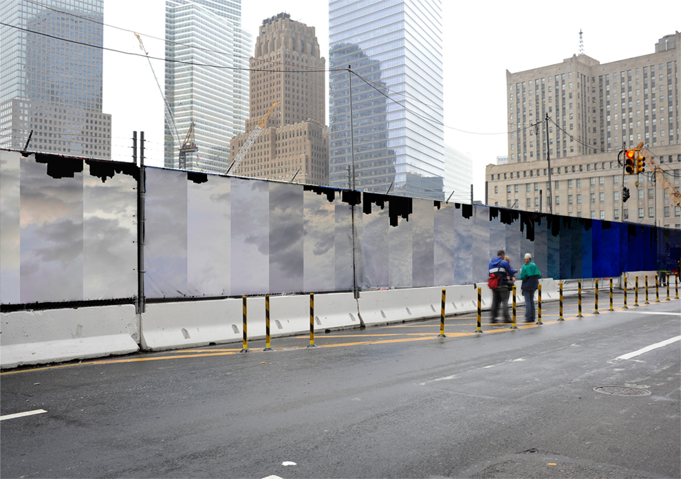
Utilizing as their canvases structures that protrude confrontationally into sidewalks or even wrap around them, artists have been given the potential to create installations that will surround and envelope pedestrians through real spatial interaction with sidewalk zones. Moreover, the temporary nature of these urban canvases suits the current preoccupation with ethereality and temporality in the contemporary art scene, though it may be difficult to create art with this kind of conceptual depth on the side of a construction fence (and get it approved by a literal-minded panel of city officials). Nonetheless, John Locke, a graphic designer and architect from New York, was able to come up with a submission for the World Trade Center site construction fence that intelligently encompasses those very themes in a way that is relevant to the New York urban landscape:
Locke’s piece focuses on the negative space between buildings in the New York skyline, drawing attention the fact that it is not just the skyline that changes with the construction of a new building but also the shape of the sky that is constantly changed by urban construction projects. By covering the fence with upside-down photographs of the sky above Manhattan, the buildings “become the void,” and “the sky is now the subject,” according to the artist.
Though there’s no limit to what artists in the Urban Canvas competition might come up with, a smaller scaled program sponsored by the New York City Downtown Alliance since 2007 (and covered in the New York Times) has produced some interesting results in the city’s downtown neighbourhood that may give us an idea of the kinds of installations to expect out of the city-wide Urban Canvas competition:
 GRO Architects, "Best Pedestrian Route," construction awning installation on John Street at Broadway, New York
This one reminds me of Fruit Stripe gum:
In particular, this 2007 installation proposed for a section of scaffolding on Fulton Street in New York suggests the kind of street-changing interventions that might come out of the Urban Canvas competition:
 Carolina Cisneros, Mateo Pinto, and Carlos J. Gomez, submission for the Downtown Alliance construction fence project
The idea of this particular piece for Fulton Street was to draw attention to visual pollution created by the hundreds of construction sites around the city. The artists appropriated the bright colors and garish patterns of construction site equipment in a way that is jarring yet visually intriguing, ironically finding beauty in the loud patterns of the very objects the piece intends to criticize.
Far more publicized than the earlier Downtown Alliance competition and drawing submissions from artists across the country, the Urban Canvas competition promises to create real, substantive public art rather than just fickle decoration. And the best part: soon you’ll be able to vote here on the project’s website for submissions you like once officials have decided on competition finalists. Surely this project will be able to provide at least a little bit of aesthetic respite and visual diversion to the lives of a lot of stressed out New Yorkers, and it is one that we are likely to see repeated in cities across the country that are also looking for a meaningful way to soften the visual impact of some of their own construction sites.
Labels:
installation art,
New York City,
urban design
Thursday, July 22, 2010
Fantastic Norway
I’d like to inaugurate my new blog by showcasing a young architecture firm from Oslo called Fantastic Norway. Their designs (the vast majority unbuilt) show a refreshing level of restraint in their crisp geometry and self-contained polygonal volumes – qualities that are all too rare in an architectural environment saturated with explosive Daniel Libeskind buildings that look like John Travolta in Saturday Night Fever (collar included) and other Frank Gehry-wannabe designs. But the real talent of Fantastic Norway lies in its ingenious marketing and networking strategies. Indeed, it seems that the studio has more stuff in its online store than it has in its portfolio of completed projects.
 The remarkable geometric similarities between Daniel Libeskind's addition to the Royal Ontario Museum and John Travolta in Saturday Night Fever
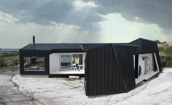 Cabin Vardehaugen in Fosen, Norway by Fantastic Norway Architects
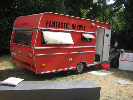
The firm got started a few years ago with two guys and a bright red camping trailer, laying the groundwork for a whole mythology now being exploited in the witty graphics of their logo-festooned online merchandise. The energetic young principals of the new firm envisioned their early practice as a studio on wheels, one that was as flexible as it was idealistic. Together they would travel and seek out work rather than waiting for clients to come to them, their trailer doubling as an eye-catching roadside advertisement all the while. Ingrained in this model was their core goal of restoring the architect’s role as an approachable resource and collaborator in the community – a people’s architect looking to share his thoughts with anyone who’ll listen.
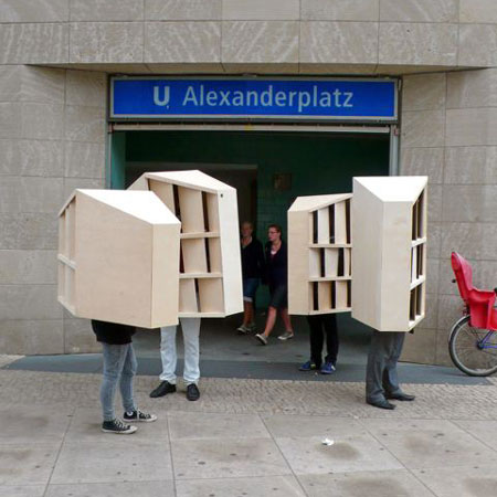
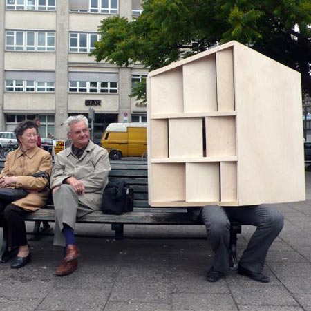
Fantastic Norway has even managed to navigate its way into the crowded contemporary art scene, an avenue that has allowed them to gain an impressive amount of publicity for a firm that is essentially still in its infant years. For one of their pieces, “Walking Berlin,” the architects dressed up as their own design for a resort complex in Norway and paraded through the streets of Berlin. As always, the architects managed to play humorously with the idea of a mobile architecture while simultaneously drawing attention to their own unique brand of design. Before that, they even made it to the 2008 Venice Biennale, where, of course, they brought their trailer and exhibited their multimedia guide, “Make it Fantastic,” a manifesto on how to be an engaging and “socially aware” architect.
Perhaps poking fun at the idea of the celebrity “starchitect,” Fantastic Norway now sells fan T-shirts and even flip flops that proudly display images of the firm’s emblematic red trailer. There’s even a downloadable template that you can print out and fold into a miniature version of the Fantastic Norway trailer so that you, too, can start your own fantastic studio.
 The remarkable geometric similarities between Daniel Libeskind's addition to the Royal Ontario Museum and John Travolta in Saturday Night Fever
 Cabin Vardehaugen in Fosen, Norway by Fantastic Norway Architects
Fantastic Norway has even managed to navigate its way into the crowded contemporary art scene, an avenue that has allowed them to gain an impressive amount of publicity for a firm that is essentially still in its infant years. For one of their pieces, “Walking Berlin,” the architects dressed up as their own design for a resort complex in Norway and paraded through the streets of Berlin. As always, the architects managed to play humorously with the idea of a mobile architecture while simultaneously drawing attention to their own unique brand of design. Before that, they even made it to the 2008 Venice Biennale, where, of course, they brought their trailer and exhibited their multimedia guide, “Make it Fantastic,” a manifesto on how to be an engaging and “socially aware” architect.
Perhaps poking fun at the idea of the celebrity “starchitect,” Fantastic Norway now sells fan T-shirts and even flip flops that proudly display images of the firm’s emblematic red trailer. There’s even a downloadable template that you can print out and fold into a miniature version of the Fantastic Norway trailer so that you, too, can start your own fantastic studio.
Subscribe to:
Comments (Atom)


