Fantastic Norway
I’d like to inaugurate my new blog by showcasing a young architecture firm from Oslo called Fantastic Norway. Their designs (the vast majority unbuilt) show a refreshing level of restraint in their crisp geometry and self-contained polygonal volumes – qualities that are all too rare in an architectural environment saturated with explosive Daniel Libeskind buildings that look like John Travolta in Saturday Night Fever (collar included) and other Frank Gehry-wannabe designs. But the real talent of Fantastic Norway lies in its ingenious marketing and networking strategies. Indeed, it seems that the studio has more stuff in its online store than it has in its portfolio of completed projects.
 The remarkable geometric similarities between Daniel Libeskind's addition to the Royal Ontario Museum and John Travolta in Saturday Night Fever
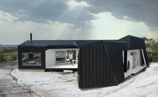 Cabin Vardehaugen in Fosen, Norway by Fantastic Norway Architects
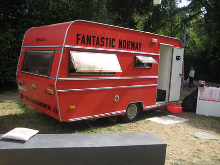 Fantastic Norway's mobile studio
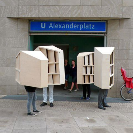
 "Walking Berlin" by Fantastic Norway Architects
 The remarkable geometric similarities between Daniel Libeskind's addition to the Royal Ontario Museum and John Travolta in Saturday Night Fever
 Cabin Vardehaugen in Fosen, Norway by Fantastic Norway Architects


No comments:
Post a Comment